

Maintenance reporting dashboards give maintenance managers and reliability engineers real-time, decision-grade visibility into asset health and work-order performance so teams can prioritize work, reduce downtime, and measure reliability improvements without waiting for a weekly report. A well-designed dashboard acts as a single source of truth, pulling live data from your CMMS, IIoT sensors, and ERP into one view so every role, from the shop floor technician to the plant manager, is working from the same numbers. The result is faster decisions, clearer accountability, and far less time spent compiling spreadsheets manually.
An effective maintenance dashboard delivers:
- Real-time KPIs updated on a defined refresh cadence (seconds to daily, depending on the metric)
- Role-specific views so a reliability engineer sees failure trends while a supervisor sees open work orders
- Threshold alerts that trigger when a metric crosses a defined limit, prompting action before a failure escalates
- Drill-down capability to move from a summary KPI to the underlying work orders, assets, or technicians in a few clicks
- Cross-system data aggregation from CMMS, sensors, ERP, and historian sources in one interface
Table of Contents
- What is a maintenance reporting dashboard?
- Which KPIs should your maintenance dashboard display?
- What types of maintenance dashboards do you actually need?
- How do dashboards differ from maintenance reports?
- How do you build an effective maintenance dashboard?
- What data sources and integrations does a reliable dashboard require?
- How do dashboards support daily maintenance decisions?
- What are the most common dashboard pitfalls and how do you fix them?
- What does a realistic dashboard rollout look like?
- How MPulse Software maps to these dashboard principles
- Key Takeaways
- What actually determines whether a dashboard program succeeds
- MPulse Software gives maintenance teams a dashboard-ready CMMS
- FAQ
- Useful sources
What is a maintenance reporting dashboard?
A maintenance reporting dashboard is a visual, interactive interface that aggregates data from multiple operational systems, typically a CMMS, IIoT sensors, ERP, and PLC historians, and presents that data as live KPIs, trend charts, and alerts. According to Tractian’s maintenance glossary, dashboards are real-time operational control tools, explicitly distinct from historical reports used for audits and stakeholder communication. That distinction matters in practice: a dashboard answers “what is happening right now and what needs attention,” while a report answers “what happened over the past month.”
The scope of a maintenance dashboard extends beyond simple charts. It covers live work-order queues, asset health scores, PM schedule compliance, labor utilization, and cost tracking, all refreshed automatically as new data flows in from connected systems.
Primary users and their needs:
- Maintenance manager: backlog status, PM compliance rate, overall cost per asset
- Reliability engineer: MTBF trends, failure mode frequency, predictive alert queue
- Planner/scheduler: open and overdue work orders, parts availability, technician capacity
- Shop floor technician: assigned work orders, priority flags, equipment status
- Operations/plant manager: OEE, production downtime, maintenance cost as a percentage of asset replacement value
Which KPIs should your maintenance dashboard display?
Choosing the right key metrics for maintenance dashboards is the single most consequential design decision you will make. Too many metrics dilute focus; too few leave blind spots. The table below covers the core KPIs most maintenance teams need, with formulas and typical measurement windows.

| KPI | Definition | Formula | Typical Window |
|---|---|---|---|
| MTTR (Mean Time to Repair) | Average time to restore an asset after failure | Total repair time ÷ number of repairs | Shift, week, month |
| MTBF (Mean Time Between Failures) | Average operating time between failures | Total uptime ÷ number of failures | Month, quarter |
| PM Compliance | Percentage of scheduled PMs completed on time | PMs completed on time ÷ PMs scheduled | Week, month |
| Unplanned Downtime | Total hours lost to unscheduled failures | Sum of unplanned downtime hours per asset | Shift, day, week |
| Work Order Completion Rate | Percentage of work orders closed within target time | WOs closed on time ÷ WOs opened | Week, month |
| Maintenance Cost per Asset | Total maintenance spend divided by asset count or value | Total maintenance cost ÷ number of active assets | Month, quarter |
| OEE (Overall Equipment Effectiveness) | Combined measure of availability, performance, and quality | Availability × Performance × Quality | Shift, day |
Measurement window matters as much as the formula. MTTR tracked at the shift level catches acute response problems; tracked monthly, it reveals systemic workflow issues. Normalize each KPI to the same time window across all assets before comparing sites or crews.
Pro Tip: Balance leading indicators (PM compliance, open work-order age) with lagging indicators (MTTR, unplanned downtime). Leading indicators tell you where failures are likely to occur; lagging indicators confirm whether your interventions worked. A dashboard that shows only lagging metrics is always looking backward.
Organizations that deploy maintenance KPI dashboards report measurable operational gains, including faster response times to equipment failures and improved asset uptime in some cases, according to Aberdeen Group research cited by PreventiveHQ. Those figures reflect what happens when teams stop hunting for data and start acting on it.
What types of maintenance dashboards do you actually need?
Not every decision needs the same view. Mixing strategic metrics with real-time alerts in a single screen creates noise that slows decisions rather than accelerating them. The four dashboard types below map to distinct roles and cadences.
-
Operational/real-time dashboard: Refreshes every few seconds to minutes. Designed for technicians and supervisors managing active work. Displays open work orders, active alarms, equipment status, and shift KPIs. A supervisor uses this during a shift handover to confirm which assets are down and which work orders are in progress.
-
Tactical dashboard: Refreshes daily or weekly. Used by planners and maintenance managers to track backlog trends, PM compliance, and labor utilization over a rolling period. A planner reviews this each Monday to set the week’s priorities and confirm parts are staged for scheduled jobs.
-
Strategic/executive dashboard: Refreshes weekly or monthly. Designed for plant managers and operations leaders who need cost, reliability, and OEE trends without work-order-level detail. A plant manager uses this in a monthly operations review to compare maintenance cost per asset across production lines.
-
Asset-health/predictive dashboard: Refreshes continuously from IIoT sensor feeds combined with CMMS history. Designed for reliability engineers monitoring condition-based alerts. Modern CMMS and IIoT integrations aggregate work-order data and sensor readings to deliver condition-based alerts before a failure occurs, giving reliability engineers time to schedule corrective work during planned windows rather than reacting to breakdowns.
Domo’s dashboard design guidance recommends limiting each view to 5–7 KPIs and including interactive drill-downs so dashboards stay decision-focused rather than decorative. That principle applies across all four types.
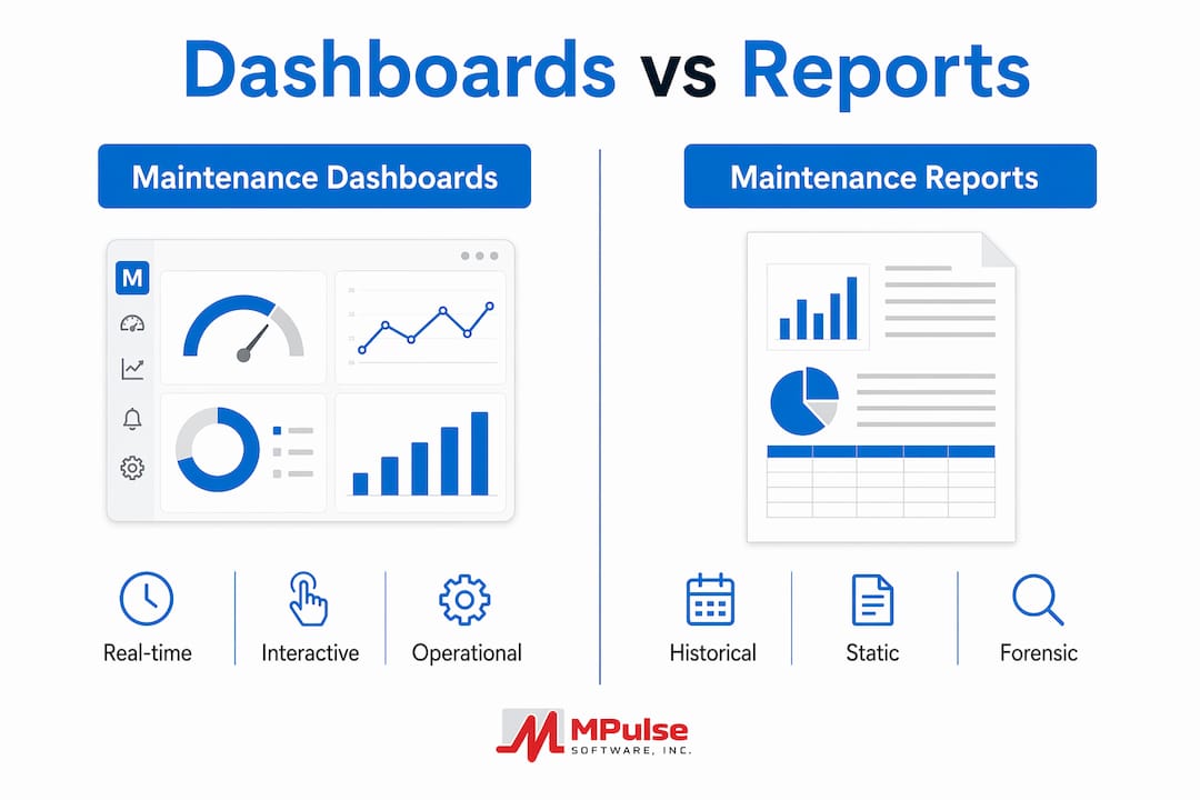
How do dashboards differ from maintenance reports?
The confusion between dashboards and reports is one of the most common causes of dashboard failure. Teams build a “dashboard” that is really a static PDF with charts, then wonder why nobody uses it for daily decisions.
| Dimension | Dashboard | Maintenance Report |
|---|---|---|
| Data currency | Live or near-real-time | Historical snapshot (fixed point in time) |
| Interactivity | Drill-downs, filters, alerts | Static; no interaction |
| Primary audience | Operators, supervisors, managers, engineers | Auditors, executives, regulators, stakeholders |
| Update trigger | Automatic, on a defined cadence | Manual or scheduled generation |
| Primary use case | Operational control, triage, daily decisions | Compliance packages, trend analysis, formal review |
A shift handover is a dashboard moment: the incoming supervisor needs to know right now which assets are down, which work orders are overdue, and what the overnight PM compliance rate was. A monthly compliance package sent to a regulatory body is a report moment: it needs a fixed, auditable snapshot that cannot change after submission.
Static reports remain necessary for compliance tracking and forensic analysis precisely because they capture a fixed snapshot rather than continually shifting live data. Dashboards and reports serve different masters; the goal is to use each for what it does best.
How do you build an effective maintenance dashboard?
Design starts with decisions, not data. The most common mistake is pulling every available metric into a view and calling it a dashboard. Start by asking: what decision does this view need to support, and who makes it?
Step-by-step build checklist:
- Define the decisions first. List the three to five operational decisions each role makes daily. Every KPI on the dashboard must directly inform at least one of those decisions.
- Select KPIs and write formal definitions. Document the formula, data source, measurement window, and owner for each metric before building anything. Undocumented KPIs breed distrust.
- Set thresholds and alert rules. For each KPI, define a green/yellow/red threshold. Example: PM compliance above 95% is green, 85–95% is yellow, below 85% triggers an alert to the maintenance manager.
- Design role-specific views. A technician’s view should show assigned work orders and asset status. A reliability engineer’s view should show MTBF trends and predictive alerts. Never force both into one screen.
- Choose visualizations deliberately. Use trend lines for time-series KPIs (MTTR over 30 days), gauges for compliance rates, and heat maps for asset failure frequency by location. Limit each view to 5–7 KPIs per Domo’s design guidance.
- Implement alerting and escalation paths. Define who receives an alert, through which channel (email, SMS, in-app), and what the expected response time is. An alert with no defined owner is noise.
- Pilot with one team, measure adoption, then iterate. Collect feedback after two weeks. Adjust thresholds, add missing KPIs, and remove unused ones before scaling.
Pro Tip: Start with a single high-impact use case, such as backlog triage or shift handover, and measure decision-to-action time during the pilot. A reduction in that time is the clearest early proof of dashboard value and the metric that earns executive support for a broader rollout.
MIT CISR research shows that companies effective at dashboarding outperformed peers across multiple performance measures, and that the performance uplift comes largely from forcing metric standardization across teams, not from the charts themselves. Agreeing on a single definition of “PM compliance” across three shifts is harder than building the chart, and more valuable.
Dashboards also reduce manual compilation time significantly, freeing analysts and planners for higher-value work rather than pulling numbers from spreadsheets each morning. Self-service analytics, where a supervisor can filter by asset class or shift without IT involvement, is one of the most cited benefits of dashboard reporting.
What data sources and integrations does a reliable dashboard require?
A dashboard is only as trustworthy as the data feeding it. Connecting the right systems and governing data quality are prerequisites, not afterthoughts.
Typical data sources and integration methods:
- CMMS: Work orders, PM schedules, asset records, labor hours, parts consumption. Usually integrated via REST API or direct database connection.
- IIoT/sensors: Vibration, temperature, pressure, runtime hours. Integrated via MQTT or OPC-UA protocols into a data historian or directly into the CMMS.
- ERP: Purchase orders, inventory costs, contractor invoices. Integrated via API or middleware to align maintenance cost data with financial records.
- PLC/historian: Machine cycle counts, production rates, fault codes. Integrated via OPC-UA or PI connector to correlate maintenance events with production data.
- Timekeeping/HR systems: Technician availability, shift schedules, overtime. Integrated to normalize labor KPIs by available hours rather than calendar hours.
Data quality checklist:
- Timestamp consistency: all systems must use the same time zone and synchronization standard
- Duplicate suppression: work orders or sensor events should not appear twice due to integration lag
- Canonical definitions: “downtime” must mean the same thing in the CMMS, the historian, and the ERP before any of those sources feed a shared dashboard
- Null handling: define what a missing sensor reading means (asset offline vs. sensor failure) so the dashboard does not misrepresent availability
Governance roles:
- Data steward: owns metric definitions and resolves conflicts between source systems
- Dashboard owner: accountable for refresh cadence, accuracy, and user adoption within a team
- IT/OT liaison: manages integration health, monitors API uptime, and coordinates firmware updates that could affect data feeds
MIT CISR’s analysis found that clearly documented metric definitions, update frequency, and ownership are prerequisites for trust in dashboard metrics. Without that governance layer, even technically accurate dashboards get ignored because users cannot verify what they are seeing.
How do dashboards support daily maintenance decisions?
The operational value of a dashboard shows up in three recurring workflows: shift handover, priority triage, and planning meetings.

Shift handover: The outgoing supervisor opens the operational dashboard and reviews overnight PM compliance, any open corrective work orders, and active alarms. The incoming supervisor sees the same view and can ask targeted questions rather than spending 20 minutes hunting through paper logs. Decision time drops from minutes to seconds.
Priority triage: When multiple work orders arrive simultaneously, a dashboard sorted by asset criticality and estimated downtime impact tells the planner which job to dispatch first. Without that view, priority decisions default to whoever called last or whoever is loudest, not to data.
Planning meetings: A weekly tactical dashboard showing backlog age, parts on order, and technician utilization gives the maintenance manager the evidence needed to justify adding a shift, expediting a part, or escalating a capital repair request to operations leadership.
Before-and-after gains maintenance teams typically report after deploying structured dashboards include reduced unplanned downtime, faster work-order response, improved PM compliance rates, and better backlog control. Pairing workflow automation with dashboard alerts shortens the decision-to-action cycle further: when a threshold breach triggers an automatic work-order creation in the CMMS, the team responds to the alert rather than waiting for a supervisor to notice the metric and manually assign a job.
Pro Tip: Connect your dashboard alerts directly to work-order creation in your CMMS. When a vibration sensor crosses a threshold, the system should generate a predictive work order automatically, assign it to the right technician, and update the dashboard queue. That loop eliminates the gap between “we saw the alert” and “someone acted on it.”
Tracking maintenance productivity metrics through a dashboard also gives managers a defensible record of labor efficiency over time, which is useful during budget reviews and when justifying headcount or equipment investments.
What are the most common dashboard pitfalls and how do you fix them?
Most dashboard programs fail not because of technology but because of design and governance mistakes that accumulate over time.
| Pitfall | Why It Happens | Mitigation |
|---|---|---|
| Too many KPIs | Teams add metrics without removing old ones | Enforce a 5–7 KPI limit per view; archive unused metrics quarterly |
| Stale data | Integration failures or manual upload delays | Monitor data feed health; set an alert when a source has not refreshed within its defined window |
| Undefined metrics | KPIs built before definitions were agreed upon | Require a written definition, formula, and owner before any KPI goes live |
| No alert ownership | Alerts fire but nobody is assigned to respond | Map every alert to a named role and a response SLA |
| Dashboard ignored | View does not match the user’s actual decisions | Conduct a 30-day adoption review; redesign views that show low engagement |
| Over-visualization | Charts added for aesthetics rather than decisions | Remove any visual that does not directly support a listed decision |
Governance keeps dashboards from drifting into irrelevance. Assign a dashboard owner for each view, document the refresh cadence, and schedule a quarterly metric review where the team confirms each KPI still drives a real decision. If a metric has not changed anyone’s behavior in 90 days, it probably does not belong on the dashboard.
Measure adoption by tracking login frequency, drill-down usage, and whether alert-triggered work orders are being created and closed within the defined SLA. Low drill-down usage often signals that the summary KPI is not raising questions, which means either the metric is too stable to be useful or users do not trust the underlying data.
What does a realistic dashboard rollout look like?
A phased rollout reduces risk and builds organizational trust before you commit to a full deployment. The table below outlines a practical four-phase plan.
| Phase | Key Activities | Sample Duration |
|---|---|---|
| 1. Prepare | Audit data sources, agree on KPI definitions, assign governance roles, map integration requirements | 4–6 weeks |
| 2. Pilot | Deploy one dashboard type (e.g., operational shift dashboard) for one team; measure decision-to-action time; collect feedback | 6 weeks |
| 3. Scale | Add dashboard types and user groups based on pilot learnings; connect additional data sources; train planners and engineers | 8 weeks |
| 4. Govern | Establish quarterly metric reviews, monitor data feed health, track adoption metrics, iterate on views | Ongoing |
Resource and cost drivers to plan for:
- Integration development (CMMS-to-ERP, sensor-to-historian connectors) is typically the largest effort item
- Licensing for BI or dashboard software, if not included in your CMMS
- Sensor hardware and installation for IIoT-enabled predictive dashboards
- Training time: plan for at least one structured session per role group, plus documentation
Pilot success criteria:
- Decision-to-action time decreases measurably for the target workflow (e.g., shift handover takes less time)
- At least 80% of target users log in at least three times per week during the pilot period
- At least one operational decision is documented as having been changed based on dashboard data
MIT CISR’s research on dashboard adoption confirms that initial uptake is slow and that repeated communication, executive buy-in, and automation with drill-downs are the factors that drive long-term use. Plan your rollout communication strategy with the same rigor you apply to the technical build.
How MPulse Software maps to these dashboard principles
MPulse Software’s CMMS is built around the operational-control use case that this guide describes. Its resource planning dashboard gives maintenance managers a live view of technician capacity, open work orders, and scheduled PM workload, directly supporting the shift handover and priority triage workflows covered earlier.
On the data-source side, MPulse connects CMMS work-order history with IIoT and real-time monitoring capabilities, enabling the condition-based alerts and predictive work-order creation that close the gap between a sensor threshold breach and a technician dispatched to the asset. That integration is the technical backbone of an asset-health dashboard.
Feature-to-principle alignment:
- Calendar interface: supports PM compliance tracking by making scheduled vs. completed work visible at a glance
- Resource planning dashboard: maps directly to the tactical dashboard use case for planners and managers
- IIoT monitoring: feeds the predictive/asset-health dashboard type with live sensor data
- Advanced customization: allows role-specific views so technicians, engineers, and managers each see the metrics relevant to their decisions
MPulse serves over 3,500 customers and reports efficiency improvements of up to 40% for teams that deploy its preventive maintenance automation alongside dashboard monitoring. For organizations in compliance-sensitive industries, the combination of structured PM records and live dashboard visibility also supports audit readiness without requiring separate manual report compilation.
Implementation tip for MPulse users: Start your dashboard pilot inside the CMMS-driven workflow by activating the resource planning dashboard for one maintenance crew. Use the built-in facility maintenance KPI tracking features to define your first five KPIs, then measure shift handover time before and after. That baseline comparison is your proof of value for scaling.
Key Takeaways
Maintenance reporting dashboards deliver operational control only when they combine clean data, documented KPI definitions, role-specific views, and a governance structure that keeps metrics current and trusted.
| Point | Details |
|---|---|
| Dashboards vs. reports | Dashboards provide real-time operational control; static reports serve compliance and historical review. |
| KPI discipline | Limit each view to 5–7 KPIs with written formulas, owners, and thresholds before going live. |
| Phased rollout | Start with one high-impact use case, measure decision-to-action time, then scale based on pilot results. |
| Governance is non-optional | Assign a dashboard owner, document refresh cadence, and review metrics quarterly to maintain trust. |
| MPulse Software | MPulse’s resource planning dashboard and IIoT monitoring map directly to the operational-control and predictive dashboard use cases described in this guide. |
What actually determines whether a dashboard program succeeds
Most dashboard programs that fail do so for a reason that has nothing to do with the software: the team never agreed on what a metric means before they started charting it. “Downtime” calculated differently in the CMMS than in the historian produces two numbers that contradict each other on the same screen, and once that happens, users stop trusting the dashboard entirely. Rebuilding that trust takes longer than building the dashboard correctly the first time.
The second failure mode is treating the dashboard as the destination rather than the tool. A dashboard that nobody acts on is just an expensive screen saver. The question to ask at every design review is not “does this look good?” but “what decision does this change, and how quickly?” If the answer is unclear, the metric does not belong in the view.
Executive sponsorship matters more than most teams expect. MIT CISR’s research on dashboard effectiveness found that persistence, repeated communication, and executive reviews are the factors that sustain adoption over time, not the sophistication of the visualizations. A plant manager who opens the strategic dashboard every Monday and asks questions based on it signals to the entire organization that the data matters. That signal is more powerful than any training session.
Start small, govern tightly, and measure the decisions the dashboard changes. That sequence, more than any specific technology choice, determines whether a dashboard program delivers lasting operational value.
MPulse Software gives maintenance teams a dashboard-ready CMMS
Maintenance teams that have followed the design principles in this guide need a CMMS that can actually deliver on them, not one that requires a separate BI tool to see basic KPIs. MPulse Software is built for exactly that operational-control use case: a maintenance management platform that combines preventive maintenance automation, a resource planning dashboard, and IIoT-compatible real-time monitoring in one system.
Where many platforms require custom development to surface role-specific views, MPulse provides a calendar-driven scheduling interface and configurable dashboards that maintenance managers can adapt without IT involvement. For compliance-sensitive industries, the combination of structured PM records and live KPI visibility means audit preparation draws from the same data your team uses every day. Over 3,500 customers rely on MPulse, with documented efficiency improvements of up to 40%.
If you are ready to move from spreadsheet-based reporting to a dashboard-driven maintenance program, request a demo of MPulse to see the resource planning dashboard and IIoT monitoring features in action.
FAQ
What is the purpose of a maintenance reporting dashboard?
A maintenance reporting dashboard provides real-time, role-specific visibility into asset health, work-order status, and maintenance KPIs so teams can make faster operational decisions and reduce unplanned downtime. Unlike a static report, it refreshes automatically and supports interactive drill-downs.
How does a maintenance dashboard differ from a maintenance report?
A dashboard is a live operational control tool that updates continuously and supports real-time decisions; a maintenance report is a historical snapshot used for audits, compliance packages, and stakeholder communication. Both are necessary, but they serve different purposes and audiences.
What are the main types of maintenance dashboards?
The four primary types are operational (real-time shift monitoring), tactical (daily/weekly backlog and PM compliance), strategic/executive (monthly cost and reliability trends), and asset-health/predictive (continuous sensor-based condition monitoring). Each type serves a distinct role and decision cadence.
What are the five basic functions of maintenance?
Maintenance functions typically cover preventive maintenance (scheduled upkeep), corrective maintenance (repair after failure), predictive maintenance (condition-based intervention), reliability engineering (failure analysis and design improvement), and maintenance planning and scheduling (resource and work-order coordination).
Which KPIs should appear on a maintenance dashboard?
The core KPIs for most maintenance dashboards include MTTR, MTBF, PM compliance rate, unplanned downtime, work-order completion rate, maintenance cost per asset, and OEE. Each should have a documented formula, measurement window, and defined threshold before going live.
Useful sources
Dashboarding Pays Off | MIT CISR
MIT’s Center for Information Systems Research analysis of how dashboard effectiveness correlates with organizational performance. Covers metric standardization, governance, adoption persistence, and executive sponsorship. Directly relevant to the governance and implementation sections of this guide.
Maintenance dashboard definition | Tractian
Concise industry definition of a maintenance dashboard, with an explicit contrast between real-time dashboards and historical reports. Useful for understanding the operational-control vs. audit-reporting distinction.
Maintenance KPI dashboard: effective performance tracking | PreventiveHQ
Covers how CMMS and IIoT data combine to power KPI dashboards, with Aberdeen Group statistics on response time and uptime improvements. Good reference for KPI selection and the measurable benefits of dashboard deployment.
Reporting Dashboard: Types, Benefits & Best Practices | Domo
Practical design guidance on refresh cadence, KPI limits (5–7 per view), drill-down interactivity, and governance documentation. Referenced throughout the build and design sections.
What is Dashboard Reporting? | Jaspersoft
Broad overview of dashboard reporting concepts, including the difference between static and live reporting, self-service analytics, and the role of dashboards in building a data-driven culture.
The Power of Reporting Dashboards | GetMonetizely
Business-intelligence commentary on how dashboards reduce manual compilation time and increase self-service analytics adoption. Useful background for the ROI and adoption sections.
MPulse Software | Product overview
MPulse’s CMMS product pages covering preventive maintenance automation, resource planning dashboards, IIoT monitoring, and calendar-driven scheduling. The primary reference for the MPulse feature-alignment section.
Facility Maintenance KPIs to Track in CMMS | MPulse Software
Practical guidance on selecting and tracking facility maintenance KPIs inside a CMMS. Useful for readers who want to move from the KPI definitions in this guide to hands-on implementation.