

Nine reports separate teams that fix problems from teams that just document them: created versus completed work orders, reactive-to-planned ratio, MTTR, MTBF, downtime analysis, PM compliance, backlog by priority, cost summary, and asset history with top failure modes. Each one pairs a specific formula with a specific action, and together they fit on one or two pages. The sections below walk through the exact calculations, what to chart, and how to turn each number into a decision.
TL;DR:
- Reports should be tailored by frequency, with critical assets reviewed daily and cost summaries evaluated monthly to ensure timely decision-making.
- The created versus completed work order ratio and reactive work percentage are key indicators of capacity and prevention efficiency, needing close monitoring.
- Asset failure analysis, including MTTR, MTBF, and failure cause ranking, helps identify problematic equipment, guiding root-cause projects before costly breakdowns occur.
- Integration between CMMS, ERP, and IoT systems automates data reconciliation, providing real-time insights and reducing manual effort.
- Maintaining a limited set of high-impact reports with assigned owners encourages consistent action and prevents reporting fatigue across teams.
Table of Contents
- CMMS Reporting Examples Every Maintenance Team Should Run
- How to Schedule, Distribute, and Act on These Reports
- A One-Page Health Check Built in MPulse
- Customization and Filtering That Make Reports Useful
- Connecting CMMS Reports to ERP and IoT Systems
- Reading the Numbers Without Overreacting to Them
- Industry-Specific Metrics Worth Adding
- Automated Alerts That Catch Problems Before the Report Does
- Why Fewer Pages Beat More Data
- Get These Reports Running Without Building Them by Hand
- Templates and Standards Worth Bookmarking
- Sources
- FAQ
CMMS Reporting Examples Every Maintenance Team Should Run
Good CMMS reporting examples share one trait: each number connects to a decision someone actually makes. A report that just sits in an inbox is overhead. A report that tells a supervisor to reassign two technicians before Friday is worth building.
Here are the reports that carry the most weight, along with the formulas behind them.
- Created vs. completed work orders. Track work orders opened and closed in the same period, then calculate completion rate as (completed ÷ created) × 100. Visualize it as a trend line with a completion percentage overlay, plotted weekly. When completion rate drops below a typical threshold of high performance for two consecutive weeks, it usually signals a capacity problem, not a motivation problem, so the action is staffing or scheduling, not a pep talk.
- Reactive vs. preventive work order ratio. Divide reactive work orders by total work orders to get your reactive percentage, and calculate PM compliance as (PMs completed on time ÷ PMs scheduled) × 100. A facility running above a typical reactive work percentage is spending money reacting instead of preventing, and the fix is almost always tightening PM scheduling before adding headcount.
- MTTR and downtime analysis. Mean time to repair equals total repair hours divided by number of repairs. Segment this by asset and by failure cause, because an MTTR that looks fine in aggregate often hides one asset dragging the average up. The iFactory maintenance report template documents exactly this calculation and warns that multi-step repairs need a documented cutoff rule, or the number becomes meaningless across sites.
- MTBF and failure counts. Mean time between failures equals total uptime hours divided by number of failures. Rising failure counts on a specific asset, even with a stable MTBF, justify a root-cause project before the next breakdown costs more than the investigation would have.
- Asset history report. List every work order, cost, downtime hour, and failure code tied to an asset, then sort by total cost or total downtime to surface your worst performers. This is the report that ends the “which pump is actually the problem” argument in about ten seconds.
- Top downtime causes (Pareto analysis). Rank failure modes by total downtime hours or total cost, not by count. A failure mode that happens rarely but costs three days each time outranks one that happens weekly but takes twenty minutes to fix. The GPMS demo dashboard shows this kind of Pareto visualization alongside weekly work order counts, which is a useful reference if you’re building your own layout.
- Work order aging and on-time vs. overdue. Flag any work order past its due date, and set escalation thresholds by priority: same-day for critical assets, 48 hours for standard, one week for low-priority. This report belongs on a supervisor’s daily view, not a monthly one.
- Backlog summary by priority and estimated hours. Group open work orders into age buckets of 0 to 2 weeks, 2 to 4 weeks, 4 to 6 weeks, and more than 6 weeks. Backlog sitting past six weeks tends to predict a rising reactive ratio a few weeks later, so treat that bucket as an early warning, not just a to-do list.
- Maintenance cost summary. Break out parts, labor, and contractor spend, then calculate cost per asset and cost per operating hour so you can compare dissimilar equipment fairly. This is the report finance actually reads.
- PM compliance calendar view. Lay out scheduled PMs against completed PMs on a calendar grid, filterable by asset class or technician, so gaps are visible at a glance instead of buried in a list.
Standardizing these formulas against the SMRP metrics guidelines matters more than it sounds like it should. If your MTTR calculation includes planned downtime at one site and excludes it at another, your cross-site comparisons are worthless, even though every number on the page looks correct.
How to Schedule, Distribute, and Act on These Reports
A report nobody reads is a wasted export. Cadence and ownership matter as much as the KPI formula itself.
- Run critical-asset reports daily. Downtime, aging work orders, and any asset flagged as safety-critical need a daily glance, ideally as a dashboard one-pager a supervisor checks before the morning huddle.
- Run supervisor-level reports weekly. Completion rate, reactive ratio, and backlog by priority work well as a weekly email summary, since these numbers move slowly enough that daily checks add noise, not insight.
- Run leadership reports monthly. Cost summary, PM compliance trends, and top failure modes belong in a PDF-attached executive summary, timed to whatever planning cycle your organization runs on.
- Assign an owner to every threshold breach. A KPI crossing its trigger point (reactive ratio above 30%, backlog exceeding a recommended duration, MTTR trending up two months running) should generate a named action item, not just a red cell on a spreadsheet.
- Check data quality before you trust the number. Missing timestamps, duplicate closures, and unreconciled parts costs quietly distort every KPI above. A confidence badge or data-quality flag on the report tells the reader whether a number is solid or provisional, which prevents bad decisions made on incomplete records.
Pro Tip: Put the actions list at the top of the report, not the bottom. If leadership only reads the first three lines before a meeting starts, those three lines should already tell them what to do, not just what happened.
A One-Page Health Check Built in MPulse
CMMS reporting can be structured around a one-page layout that mirrors the iFactory health check template: headline KPIs across the top, an asset drilldown table in the middle, top failure modes on the side, and a short actions list at the bottom with an owner assigned to each line.
Several CMMS features map directly onto the KPIs covered above:
- A calendar interface can display PM compliance visually, showing scheduled versus completed tasks by day, which makes gaps obvious without exporting a separate report.
- Integration capabilities can pull sensor and ERP data into the same dashboard, so downtime and cost figures don’t require manual reconciliation between systems.
- Reporting delivery options can include dashboard embeds for daily use and PDF exports for the monthly leadership summary, matching the cadence guidance above.
A data-quality indicator on each report card can flag low-confidence figures, so supervisors know when a number needs a second look before it drives a decision.
Customization and Filtering That Make Reports Useful
A report locked to one layout stops being useful the moment your operation changes shape. Filtering by asset class, location, technician, or priority level turns one report into a dozen relevant slices without building a dozen reports.
Filtering by date range matters more than most teams realize, since a monthly report and a rolling 90-day report tell different stories about the same data. A single bad week can distort a monthly view but disappear in a quarterly trend, so having both available prevents overreacting to noise.
Role-based views also cut down on report fatigue. A technician needs their own aging work orders and nothing else; a plant manager needs the cross-site comparison. Building both from the same underlying data, filtered differently, keeps the numbers consistent while keeping each audience focused on what they can act on.
Custom fields deserve attention too. If your operation tracks something SMRP’s standard definitions don’t cover, like a compliance flag specific to your industry, add it as a filterable field rather than a footnote. Buried context gets ignored; a filter column gets used.
Connecting CMMS Reports to ERP and IoT Systems
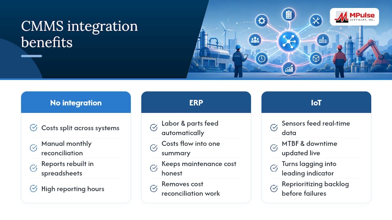
Cost figures split across a CMMS and an ERP system create two versions of the truth, and reconciling them manually every month is where a lot of reporting hours disappear. Integration between the two systems means labor and parts costs flow into the same cost summary automatically, instead of getting rebuilt in a spreadsheet each cycle.
IoT and condition-monitoring sensors add a different kind of value: they feed real-time data into downtime and MTBF calculations without waiting for a technician to log a work order after the fact. A vibration sensor flagging early bearing wear, tied into the same reporting dashboard that tracks MTBF, turns a lagging indicator into something closer to a leading one.
The practical benefit shows up in the backlog and cost reports specifically. Sensor-fed condition data can justify reprioritizing a backlog item before it becomes an emergency work order, and ERP-fed cost data keeps the maintenance cost summary honest instead of running on estimates. Neither integration is required to get value from the reports above, but both remove the manual reconciliation that eats into the time a maintenance manager could spend acting on the numbers instead of assembling them.
Reading the Numbers Without Overreacting to Them
A single bad MTTR week rarely means anything on its own. Look for two or three consecutive periods moving the same direction before treating a KPI shift as a real trend rather than noise from a handful of unusual repairs.
Context matters as much as the number itself. Compare each KPI against its own history first, and only against industry benchmarks second.
Every KPI report should end with an owner and a deadline, not just a chart. A backlog report that shows the four-to-six-week bucket growing means nothing if nobody is assigned to shrink it. The iFactory framework recommends pairing each headline metric with a one-line action, and that discipline is what separates a report from a to-do list dressed up as data.
Industry-Specific Metrics Worth Adding
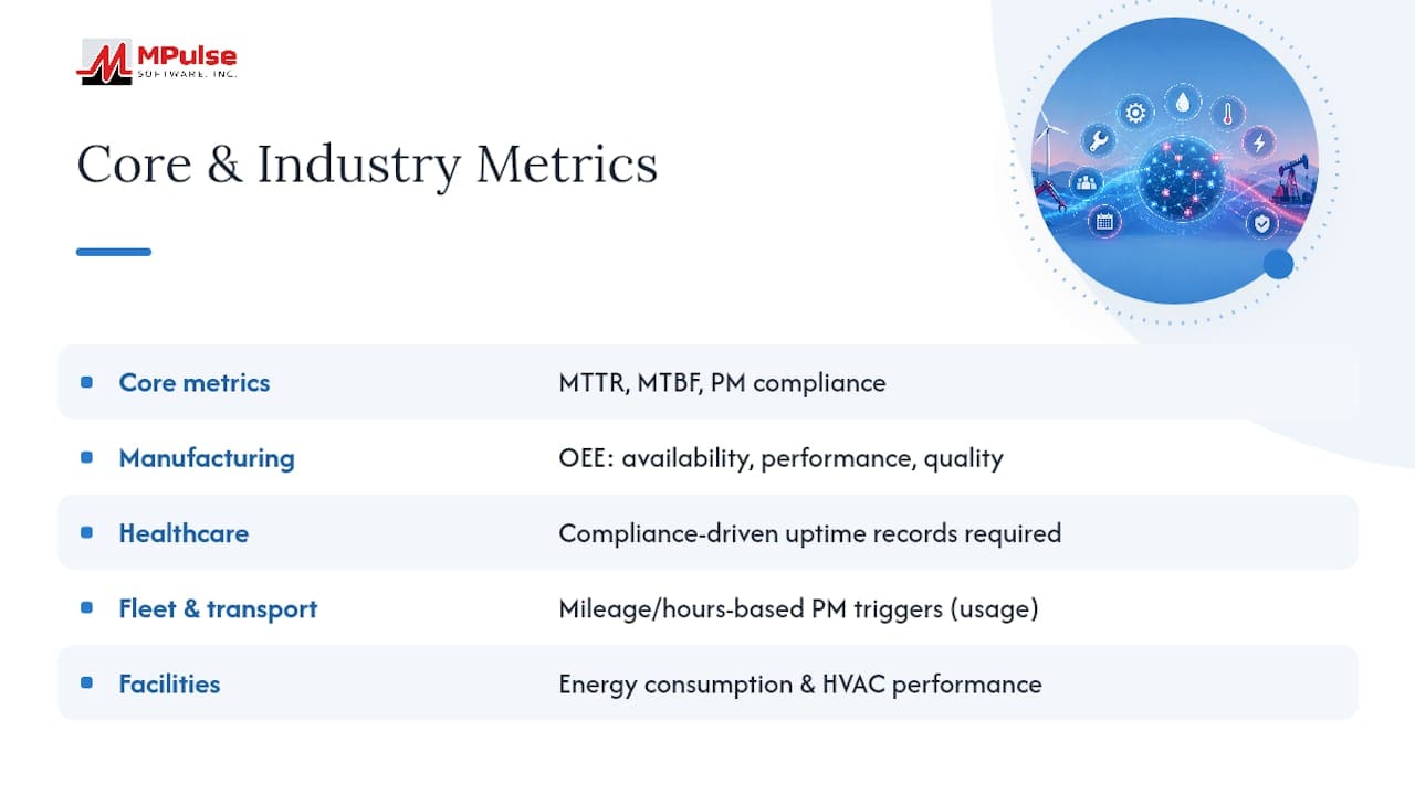
Manufacturing plants often layer Overall Equipment Effectiveness on top of the standard KPI set, tracking availability, performance, and quality together, rather than treating downtime as a standalone number. Healthcare facilities lean harder on compliance-driven metrics, since equipment uptime for life-safety systems carries regulatory recordkeeping requirements that a standard backlog report doesn’t capture.
Fleet and transportation operations typically add mileage-based or hours-based PM triggers instead of pure calendar scheduling, since a vehicle’s wear depends on usage, not the date. Facilities management in commercial real estate tends to weight energy consumption and HVAC performance metrics more heavily, since tenant comfort complaints often surface before a formal work order does.
None of these replace the core nine reports. They sit alongside PM compliance and cost summary as an additional layer specific to what the assets actually do. A maintenance manager moving between industries should expect the underlying formulas (MTTR, MTBF, PM compliance) to stay constant while the industry-specific additions change what gets prioritized on the dashboard.
Automated Alerts That Catch Problems Before the Report Does
Waiting for a weekly report to flag a critical asset failure defeats the purpose of having real-time data at all. Threshold-based alerts close that gap by pushing a notification the moment a KPI crosses a defined line, rather than the next time someone opens a dashboard.
Setting these thresholds requires knowing your own baseline first. A generic industry number is a starting point, not a rule, since a facility with older equipment might reasonably run a higher reactive ratio than one with newer assets.
Alert fatigue is the real risk here. A system that pings supervisors for every minor deviation trains people to ignore notifications entirely, which defeats the purpose of automating them in the first place. The fix is tiering alerts by severity, so a critical-asset downtime alert reaches a phone immediately while a minor PM compliance dip waits for the weekly summary. That distinction between what deserves an interruption and what belongs in the compiled report is worth setting deliberately, not by default settings.
Why Fewer Pages Beat More Data
Teams that switch from a twelve-tab spreadsheet to a one-page health check almost always report the same thing: the spreadsheet had more data, but the one-pager got read. Hours spent compiling numbers nobody acted on is the actual cost of over-built reporting, not the software license.
The fix that works isn’t more automation for its own sake. It’s picking the nine reports that matter, assigning an owner to every action item, and holding the reporting cadence steady even when the numbers look fine. Frameworks like SMRP’s metric definitions and ISO 14224’s failure classification exist to keep that discipline consistent across sites, not to add paperwork.
Reporting fatigue kills more CMMS rollouts than bad data does. Keep the page count down, and the reports stay useful long after the initial rollout enthusiasm fades.
— Mark
Get These Reports Running Without Building Them by Hand
Some CMMS platforms turn report formulas into dashboards that update automatically instead of spreadsheets someone rebuilds every Monday morning. Where a manual process means pulling work order data, calculating MTTR by hand, and formatting a PDF before a leadership meeting, automated systems generate the one-page health check directly from calendar interfaces and integration data already flowing through the system.
That means less time reconciling numbers between your CMMS and ERP, and more time acting on what the backlog and cost reports actually tell you. If your team is still assembling PM compliance and downtime figures manually, take a look at the MPulse CMMS platform and see how the reporting layout maps onto your own asset list.
Templates and Standards Worth Bookmarking
Start with the SMRP metrics guidelines for standardized KPI definitions, then pull the MapTrack free maintenance report template for a compile-it-yourself starting structure. Reviewing MPulse’s own CMMS report examples alongside these adds a few more layout options worth adapting to your own definitions.
Sources
FAQ
What is an example of a CMMS?
MPulse CMMS is an example of a computerized maintenance management system, handling work orders, preventive maintenance scheduling, asset tracking, and reporting in one platform.
What are five examples of CMMS reports?
Five commonly used reports are the created versus completed work order report, the PM compliance report, the MTTR and downtime analysis, the backlog summary by priority, and the maintenance cost summary.
Can you give an example of planned preventive maintenance?
A planned preventive maintenance task might be a monthly filter replacement scheduled on a fixed calendar interval, tracked and confirmed through a PM compliance report rather than triggered by a breakdown.
What is the most common CMMS software?
There’s no single dominant CMMS across all industries, since the right choice depends on facility size, compliance requirements, and integration needs, but platforms like MPulse are widely used across manufacturing, healthcare, and facilities management.
How often should CMMS reports be reviewed?
Critical-asset and aging work order reports work best reviewed daily, supervisor-level KPIs like completion rate and backlog weekly, and cost and compliance summaries monthly for leadership review.